Mystery Monday

Sartorial sleuths, you may need your textbooks for this mystery:

What two occupations are represented in this illustration by Erhard Schoen?

How did their relationship change in 1675 in the city pictured below?

Think you know? Post your guesses below; we will reveal the answer on Thursday morning!

Posted in Mystery Mondays | Tagged | 1 Comment

Mystery Monday: Picasso and Parade

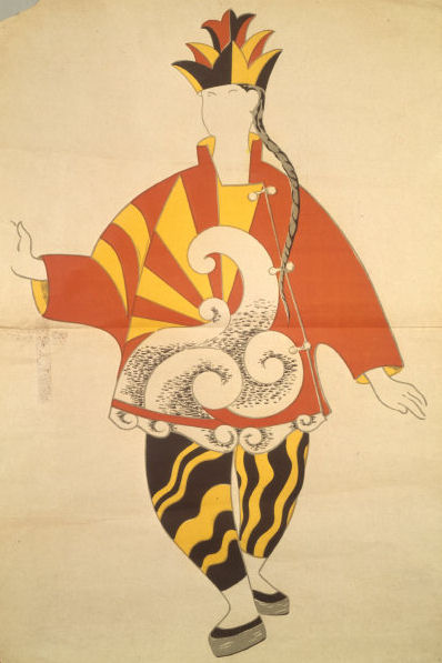
Costume design of the Chinese for Parade, 1917 (Paris, Théâtre Archive Champs-Elysées); © 2007 Estate of Pablo Picasso/Artists Rights Society (ARS), New York, photo credit: Giraudon/Art Resource, NY

Yes, Pablo Picasso designed this costume for the Ballets Russes’s Parade in 1917. 

Picasso was asked to design the costumes for several Ballets Russes productions, including Le Tricorne (1919), Pulcinella (1920), and Cuadro Flamenco (1921). It was not unusual for famous artists to be involved with these modern performances; Léon Bakst, Henri Matisse, and Georges Braques were also commissioned to create costume and set designs for the Ballets Russes.

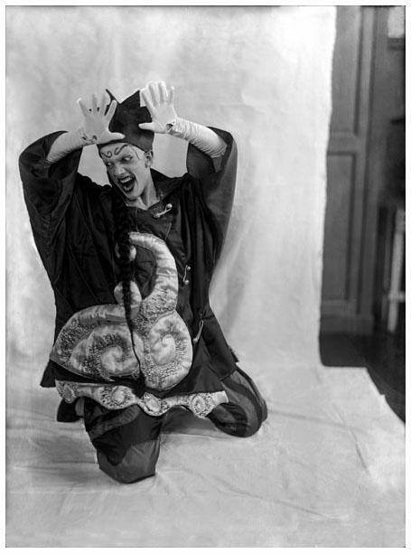
Glass negative by Lachmann showing Léonide Massine as the Chinese Conjuror in his ballet Parade, Diaghliev Ballets Russes, 1917. © Victoria and Albert Museum.

For more images of these costumes, please visit the Victoria and Albert Museum’s online collection.

In the 1920s, Picasso began to collaborate with interior and fashion designers. While few examples of his work from this period remain, we know that he collaborated Jean-Michel Frank, master of texture, scale, and neutral color schemes:

Bowles, Hamish. “Vogue Style: Living: To Be Perfectly Frank.” Vogue, 1994.

Around this same time, Picasso began working with Marie Cuttoli, designing textiles for her fashion house, Myrbor. The fashion house opened in 1922 and soon attracted a clientele who admired elegant, modern clothing and interior accent pieces, like the hand-woven rugs of Picasso’s design. For the next fourteen years, Cuttoli commissioned unique designs from Picasso, Matisse, Bakst, and Natalia Goncharova, a Russian Futurist artist. Like the others, Goncharova also designed for the Ballets Russes. Here is a Myrbor coat that has not been attributed to a particular designer:

Coat of embroidered wool with gold thread, designed for Marie Cuttoli, retailed by House of Myrbor, Paris, 1925. © Victoria and Albert Museum.

House of Myrbor label from 1925. © Victoria and Albert Museum.

House of Myrbor closed in 1936. While few of Myrbor’s garments and textiles remain, these few examples can be found in various costume collections, including the Victoria and Albert Museum and the Metropolitan Museum of Art. Some of the hand-woven rugs bearing Picasso’s designs can be found for sale though online art auctions.

Picasso’s later textile designs, in the 1950s and 1960s, are vastly different from his early cubist designs. Their strong lines and colors create bold repetitions of household items and simple shapes, which become frenetic patterns of entangled abstractions. Examples of these textiles are widely available in museum collections around the world.

Picasso, Pablo for Fuller Fabrics. “Notes,” 1956. © Victoria and Albert Museum.

What is most remarkable about Picasso’s textile designs is their commercial viability. Picasso reacted strongly to changes in the marketplace, and continued to offer fresh and relevant designs for over four decades. I could not find any examples of Picasso participating in garment design beyond his designs for the Ballets Russes, but his many textile designs demonstrate how easily his artwork transitions to the woven canvas.

Further evidence of this is found in some of Gilbert Adrian’s designs from the 1940s. Adrian’s adaptation of cubist paintings into hand-sewn garments became his signature style. His creations, made from brightly colored fabrics cut in unusual shapes, are strikingly similar to paintings by Picasso and Braques.

Adrian, Gilbert. Dinner Dresses, silk, c 1944. © The Metropolitan Museum of Art.

I hope that you enjoyed this brief introduction to Ballets Russes, Picasso’s textile and costume designs, House of Myrbor, and Gilbert Adrian. Hopefully, it has inspired you to learn more about something or someone.

What next’s week’s mystery? Visit us on Monday and find out!

Notes:

Bowles, Hamish. “Vogue Style: Living: To Be Perfectly Frank.” Vogue, 1994. 273

Bayer, P. Art Deco Interiors: Decoration and Design Classics of the 1920s and 1930s. London, 1990.

The National Gallery  of Australia, Ballets Russes: The Art of Costume.

Online Collections Database, Victoria and Albert Museum.

Online Collections Database, The Metropolitan Museum of Art.

The National Gallery  of Australia, Ballets Russes: The Art of Costume.

Visual Information Access catalog for the Harvard Theatre Collection at Harvard University. (Online.)

Posted in Mystery Mondays | 2 Comments

Mystery Monday

Hello, scholarly sleuths. Our second Mystery Monday has arrived!

Here is today’s image:

Mystery Monday 9/17

Who drew this design? For what event was it created?

Think you know? Submit your guess below. Be sure to visit on Thursday to see if you’re right!

Posted in Mystery Mondays | Tagged | 3 Comments

Mystery Monday: Solved!

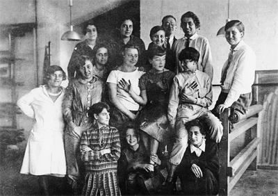
Unidentified Women Weavers at Bauhaus c. 1927, Bauhaus Archive, Berlin.

Yes, these lovely ladies are from the Weaving Workshop!

The Barbican’s recent exhibit, Bauhaus: Art as Life, has renewed public interest in the Bauhaus school. The exhibit showcased the designs, fine art, and crafts produced by the students and Masters from its conception in 1919 to its closure in 1933. While the school readily accepted both male and female students, the only female professor, or Master, was Gunta Stölzl. Stölzl taught the Weaving Workshop, a course of study designated for women, as contemporaries considered weaving a women’s craft. In Bauhaus Women: Art, Handicraft, Design, the author Ulrike Müller describes the impact these women had on the textile industry:

The Bauhaus Women in the weaving workshop were the source of important developments for individual textile art as well as for modern industry, not just in Germany but also in countries such as Switzerland, England, Israel, and the United States…. Supported by fairly unsystematic teaching, and continuous trial and error, they created works with completely new patterns, shapes and color combinations created from the basic colors such as yellow, red, and blue, or striped patterns in shades of black and white.

While the women in the above photo are not identified, you will recognize the names of some of the members of the Weaving Workshop, including Anni Albers, Gertund Arndt, Otti Berger, and of course, Master Gunta Stölzl. I’ve assembled a collection of quotes from these women:

Anni Albers

“Every beginner should be afforded this freedom of creativity. Courage is a key factor in every form of artistic creative process, it can best unfold when it is not curtailed too early by knowledge.”

Anni Albers, Die Werkstatt der Weberei (The Weaving Workshop)

Albers, Anni. Drapery Material, 1923-1926. Cotton, 9.2 x 20 cm. Museum of Modern Art, New York.

Gertund Arndt

“They all went to the weaving workshop, whether they wanted to or not. Yes, that was simply the way out….I never wanted to weave. It was absolutely not my aim. No, not at all. All those threads, I didn’t want that. No, that was not my thing.”

Otti Berger

“To become an artist, one has to be an artist and to become one when one is already an artist, then one comes to the Bauhaus, and the task of the Bauhaus is to make  a human being of this ‘artist’ again.”

Otti Berger, Bauhaus Archive, Berlin.

Gunta Stölzl

“We wanted to create living things with contemporary relevance, suitable for a new style of life. Huge potential for experimentation lay before us. It was essential to define our imaginary world, to shape our experiences through material, rhythm, proportion, color, form.”

Gunta Stölzl, reflecting on her time at the Weimar Bauhaus in Bauhaus. Zeitschrift für Gestaltung, July 2, 1931

Stölzl, Gunta. Design for Double-Woven Cloth, 1925. Watercolor on square-ruled paper, 17.5 x 22.5 cm. Museum of Modern Art, New York.

I hope that these quotes provide some insight into the minds behind the faces of the women of the pictured in this week’s image. Be sure to check back on Monday for next week’s mystery!

Source: Müller, Ulrike. Bauhaus Women : Art, Handicraft, Design. English-language ed. London: Thames & Hudson, 2009.
Posted in Uncategorized | 2 Comments

Designer Highlight: Zoran

Have you heard of Zoran? No? One gets the feeling he prefers it that way.

Zoran (pronounced ZOR-run) Ladicorbic, known by his first name, doesn’t advertise. He doesn’t have a biography on Oxford Art Online. He has no website to display his collections. He does have a Wikipedia page, but it’s in French.

Very little is known about Zoran’s life. He was born in 1947 in Yugoslavia, and studied architecture in Belgrade before moving to the United States in the 1971.  “After five years here, he put together his first collection, consisting of a shirt in three lengths, a pair of pants and a skirt, all in crepe de chine.  The tops were ivory; the bottoms black” (3). This formula, a few designs in a limited color palette, became a characteristic of his collections.

Photograph: Arthur Elgort, from “Zoran: The Wizard of Ease” Vogue, March 1983, page 354.

In May 1995, in an interview for the Wall Street Journal, Zoran said of his designs, “This is future, this is jet-pack fashion” (1). His most loyal customers are familiar with comfortable surrounding and exotic destinations, and the timeless quality and simple shapes in Zoran’s design appeal to these “Zoranians.” Many of his designs lack popular closures and decorations, including button, bows, beads, snaps, zippers, and ruffles. The simplicity of his designs brings attention to the fine quality natural fabrics Zoran favors; it is difficult to find one of his designs that has not been realized in silk, cashmere, wool and linen.

Color is also important. “The backbone of his line is five easy pieces he devised when he started the business in 1975. The pants, skirt, top, jacket and dress are recycled annually in sumptuous fabrics but always in a limited range of neutral colors — brown, camel, ivory, gray, black” (1). In an article in the New York Times, the author notes that in his collections, “the colors tend to be neutral gray, beige and black with a shot of purple, red or blue” (3).

Photograph: Arthur Elgort, from “Zoran: The Wizard of Ease” Vogue, March 1983, page 357.

Most popular in the 1970s and 1980s, Zoran’s designs were featured in several of Vogue’s spreads. His designs were popular with famous clients such as Oprah Winfrey, Candice Bergen, Lauren Bacall, and the late Jackie Onassis. He is also famous for his strong opinions about women’s jewelry, hair, and weight. In an article published in May 1995 in the Wall Street Journal, the author recounts the following event:

Last November, well after midnight and many Stolis, Zoran sat in his loft surrounded by a handful of clients. As it often does, the talk turned to hair. Suanne Orenstein, a Minneapolis buyer, casually asked Zoran whether she should continue to let hers grow.
“No,” he boomed. “You need to cut it — now.”
Draping a tablecloth around Ms. Orenstein and grabbing two pairs of fabric shears, Zoran, working by candlelight, began whacking off hair. He is quite good at this and does it for customers all the time because he hates long hair. He was finished moments later. Ms. Orenstein picked up a hand mirror to inspect the results, hugging Zoran as his friends clapped.

Photograph: Arthur Elgort, from “Zoran: The Wizard of Ease” Vogue, March 1983, page 358-9.

Visitors to Part One and Part Two of The Museum at FIT’s exhibit, Fashion, A – Z, will be familiar with the name Zoran. Part One of the exhibit included one of Zoran’s designs, a purple silk halter ensemble trimmed with ropes, and Part Two, which is open to the public until November 10, 2012, ends with Z, a taupe and crepe jumpsuit designed by Zoran.

The press has been silent about Zoran in the last decade. In an interview recorded on April 18, 1996 in the Chicago Tribune, reporter Teresa Wiltz quotes the strong-willed designer, recording his views on politics, his delights and fears, and his opinion of about the future. His opinion on the future, in 1996, was this: “Very bright. Each generation, they’re always speaking the end. I don’t see yesterday as better. It’s always better tomorrow.”

Notes:
1. Agins, Teri. “Uniquely Chic: If Zoran Doesn’t Ring a Bell, that is Fine with Quirky Designer.” Wall Street Journal, May 08, 1995,
2. Horyn, Cathy. “Zoran, the Master of Deluxe Minimalism, Still Provokes.” New York Times, April 20, 1999.
3. Morris, Bernadine. “Zoran and Kamali: Success with the Offbeat.” New York Times. Jan 04, 1983.
4. Wiltz, Teresa. “Getting All Wrapped Up in the World According to Zoran.” Chicago Tribune, April 18, 1996.
Posted in Designer Highlight | Tagged , , , | 11 Comments

Our New Feature: Mystery Mondays

This is the first post of our new feature called Mystery Mondays. Every Monday morning we will post a new image and ask you to identify the persons, place, or objects within it.  If you think you know,  add your comment here. On Thursday morning, we will provide the answer to our question along with some additional information about the subject. Get ready to guess!

Q: Who are these women?

Think you know? Post your answers below. Be sure to visit on Thursday when we reveal their identities!

Posted in Mystery Mondays | 2 Comments

Guest Post- War in Conflict: World War I, Haute Couture and the Fashionable Body (Part II)

By Katy Conover

 Katy Conover is currently working as a research assistant at the Victoria & Albert Museum on the upcoming “Hollywood Costume” exhibition. She received her MA from the RCA/V&A program in History of Design. Her current research focus on early 20th century fashion and the body. This post is from a presentation I she at the Women in Magazines Conference June 23-24 at KingstonUniversity, Kingston, England.

As discussed in the previous post, the early years of World War I were espousing a unified visual aesthetic between illustration, photograph, and text that started to deteriorate as the war progressed.  Nineteen sixteen was the year in which the disunity was at its greatest.

Vogue, January 15, 1916

In this year, the fashionable silhouette in illustrations had shifted to a more ‘traditional’ feminine shape with a natural waistline, fitted bust, and a wide skirt in the pages of Vogue. 

The Queen, March 4, 1916

 Even The Queen’s illustrations were supporting this image.  To add to this, the text form 1916 was promoting a youthful silhouette.  The Queen remarked that ‘[a]ll the new models are extraordinarily youthful for youth is privileged in France, and is almost tyrannical when it is a question of fashion.’[1]  Vogue also mentioned that, ‘[t]he “young thing” appears everywhere, an astounding combination of worldliness and ignorance […] a wild mixture of Paris futurism, the primitives, and a little rouge […].  She is feverishly interested in two things, herself and her clothes.’[2]  Note that there is no mention of the war here.  In this year, the disunity becomes blatant.  Considering Vogue’s focus on Paris, the assumption would be that the magazine would also focus more information on the war and the fashion industry in Paris.  However, this was not the case.  For 1916, the war and fashion were still separate issues.  In the March 15, 1916 ‘Paris Openings’ issue, the main fashion article, ‘The Tale of the Paris Openings’ did not mention the war at all in the article.[3]  Even Vogue’s editor, Edna Woolman Chase’s autobiography refers to the war with nonchalance: ‘in the trenches our circulation was second only to the Saturday Evening Post.  At first I couldn’t believe it, but I suppose in a way it was natural.  Vogue is about women and their frills and furbelows; it is a vastly different diet from mud and uniforms, boredom and death.’[4] 

In contrast, by June 1916, women were being told in Vogue that the fashionable body would be wearing a slimmer silhouette despite being shown the contrary:

some of the smartest houses are advocating the slender silhouette, there is every reason to expect that limp frocks will be demanded by the clients themselves, and the society, like the little Quaker maiden, will “rip the hoops out of its gown.”  The “slender” silhouette does not mean a return to tight skirts—not at all.  In fact, skirts will remain ample, but the fulness [sic] will be softly and limply disposed.[5]

 Additionally, in The Queen’s March 4, 1916 issue, Mrs. Jack May lamented that:

[w]omen just now seem to be divided into two communities—those who are too panicky to dare to spend money, even when on necessary dress requirements, the others paying not the slightest attention to the pleas for economy and spending as freely as ever […].[6]

Yet in the same article she contradicts her previous statement:

And afterwards, when this wearisome, long-drawn-out war ends, we shall look back on having been taught the valuable lesson of how to administer a dress allowance with care […]; also the realisation how, given the proper care and intelligent attention, it is possible to dress well and at the same time economically.[7]

However, M.E. Clarke’s November article ‘Causerie de Paris,’ lamented that, ‘nothing but cloth is being used, and never have the skirts been wider.  They look less wide in effect because there are so many pleats, but they take an enormous amount of material.’[8]  It is notable that the silhouette was supposed to look ‘less wide,’ but the dresses still required an ‘enormous amount of material.’

Vogue, November1, 1916

Vogue, November1, 1916

In these illustrations from Vogue on November 1, 1916, the ‘Straight Way of Paris’ shows the ‘less wide’ skirt, but it still appears to be just as full as the earlier versions.

Vogue, July 1, 1916

 In this illustration, the long tea gown with the kimono-style sleeves did not appear to be using moderation in the least.

Vogue, June 1, 1916

Vogue, August 15, 1916

However, when examining the photographs from this year, the dissimilarities are obvious.  Putting the earlier illustrations from Vogue’s June 1, 1916 issue alongside a photograph from August 1, 1916, one can observe Adorno’s montage at work.  It is through these seemingly incongruous images that a more complete picture of the fashionable body becomes evident.

This image shows the beginning of the transition towards the idea of unity as the illustrated examples here more closely mirror the illustrated ones, which both follow the ‘slender silhouette’ mentioned in the text.  However, it should be noted that the above text from June 1916 does not seem to be made visually relevant until these examples in October and November of 1916.

Vogue, November 1, 1916

Vogue, February 1, 1917

In the final two years of the war, the magazines introduced the ‘Barrel Silhouette,’ which reintroduced the narrow silhouette of the 1914, and was almost the opposite fashionable body from that of 1916.  In Vogue’s UK edition from Early April 1917, ‘[t]here are just three things one can wear in town this spring,–a tailored suit, a one-piece dress, or a dress with a coat.’[9]  This was supported by the above Illustration in which all of these women are wearing one of the examples listed in the Vogue quotation above.  Even The Queen weighed in: ‘[t]he rule is a tailor-made, and, if not, the very simplest of frocks.’[10]

Vogue, April 1, 1918

 However, unity was not completely seamless.  In this example from the ‘Paris Openings,’ April 1, 1918, the narrower silhouette only reflected a simplicity in external shape while the internal line remained complex.  The three dresses at the top of the page all have multiple layers and the dresses on either end both have kimono sleeves all requiring more fabric than would be necessary if simplicity and thrift were the real goals.  All of these dresses have complex necklines requiring extra fabric—such as the ‘scarf’ neckline in the top left illustration.  Additionally, these dresses have an internal complexity, which cannot be conveyed by the silhouette alone such as the illustration on the lower right which has a gathered neckline, a waistband with a large appliqué insert on the front, and a split overskirt with a longer underskirt.

The introduction of the ‘Barrel Silhouette’ was the moment when the illustrations and the photographs, especially, began to merge into a similar silhouette.

Vogue, January 15, 1918

Vogue, August 1, 1917

 Here the dresses these society women are wearing mirror the illustrated garments.

It is important to note that after America’s entry into the war, the silhouette began to unify across the three types of sources.  The only explanation for this shift comes from historian Elizabeth Miner King in 1917 in which, ‘[w]ar conditions have forced the business of the importation of wearing apparel from Paris to the United States almost to the wall.  Therefore American designers have had to supply an industrial demand in the clothes line.’[11]  The entry of the US into the war seems to have influenced the ‘look’ of the fashionable body across the different sources.  However, this particular change needs further exploration.

Despite this, it is important to emphasize that at this moment, the montage was reaffirming unity.  In August 1917, Vogue seems to also be integrating the war into the fashionable body with the article titled ‘The Fashions of Paris Lead the Simple Life’ with the subheading: ‘Paris Is in No Mood for Gay Colors and Amazing Silhouettes; Wartime Frocks Must Be Simple of Line and Quiet of Color—but They Are Allowed All the Charm They Want.’[12]  Even Vogue changed the name of its regular article ‘Smart Fashions for Limited Incomes’ to ‘Dressing on a War Income’ in the February 1, 1918 issue—a change which occurred in the British edition Early March 1918—this change did not affect the main fashion content about the Paris designers.  As reflected in the shift from a complex silhouette to a complex internal line, fashion seems to have conformed to the demands for simplicity of silhouette during the war.  However, it must be reiterated that this was more a shift from a complex silhouette to a complex internal line.  It was this unified montage which has led Francois Boucher to remark that ‘[t]he 1914-18 war left women mistresses of their own fashions for four years by freeing them from their dependence on couturiers… liberated from their enslavement to the demands of the couture at exactly the time when new needs spurred them to look for more convenience and comfort in clothing.’[13]   And by 1918, Richard Barry had hoped this change would, ‘lift us, as a nation, from the semi-barbarism of clothes-silliness to a higher aesthetic plane of clothes-adornment.’[14]  Regardless of the ‘success’ of this statement, the unity achieved is significant as it is creating a unified fashionable body for women—a unity that was absent in the early years of the war.  In short, the fashions in 1917 and 1918 seemed to have conflated into a unified visual aesthetic, which firmly established a hegemonic visual culture, which led to a fashionable body more unified in silhouette than was evident in 191


[1] M.E. Clarke, ‘Causerie de Paris’, The Queen, 21 October, 1916, p. 576.
[2] Mildred R. Crux, ‘The Extreme Adolescence of America’, Vogue (US), 1 February, 1917, p. 66.
[3] ‘The Tale of the Paris Openings’, Vogue (US), 15 March, 1916.
[4] Edna Woolman Chase and Ilka Chase, Always in Vogue (Victor Gollancz Ltd: London, 1954), p. 129.
[5] ‘Paris Rolls Away the Hoop: The Full Skirt Will Still Be with Us, but the Distended Skirt is Packing Up Its Crinoline and Bidding Us a Lingering Farewell’, Vogue (New York), 15 June, 1916, p. 39.
[6] Mrs. Jack May, ‘Fashion’s Forecast’, The Queen, 4 March, 1916, p. 360.
[7] May, p. 360.
[8] M.E. Clarke, ‘Causerie de Paris,’ The Queen, 4 November, 1916, p. 634.
[9] Vogue (London) Early April 1917, p. 36.
[10] M.E. Clarke, ‘Causerie de Paris,’ The Queen15 July, 1916, p. 97.
[11] Elizabeth Miner King, ‘War, Women, and American Clothes: Dress, the Money-Maker’, Scribner’s, 62 (1917), pp. 592-598 (592).
[12] ‘The Fashions of Paris Lead the Simple Life’, Vogue (US), 1 August, 1917,p. 29.
[13] François Boucher, 20,000 Years of Fashion: The History of Costume and Personal Adornment (Harry N. Abrams, Inc.: New York, 1967), p. 408.
[14] Richard Barry, ‘“Style” in Women’s Clothes’, The North American Review, 207 (750), May 1918, 729-34 (p. 730).
Posted in Uncategorized | 1 Comment

Then & Now

(left) Gwili Andre, 1932. Photograph: Cecil Beaton. (right) Kate Moss at the Ritz, Paris. Photographer: Tim Walker, Styling: Grace Coddington. Scanned from Vogue, April, 2012.

Posted in Then&Now | Tagged , , , , , | Leave a comment

Guest Post: Lagerfeld’s Questionable Legacy

By Cary O’dell

Cary O’Dell’s work has appeared on PopMatters.com, Thoughtcatalog.com and Wornthrough.com.  His book, “June Cleaver Was a Feminist!  Reconsidering the Female Character of Early Television,” will be published in the fall by McFarland.  He works for the Library of Congress and lives in Culpeper, VA. 

As of this writing, designer Karl Lagerfeld has been at the helm of the House of Chanel for 29 years.  That’s a lot of brass buttons.  And camellias.  And gold necklaces.  And tweeds, jackets, and quilted bags, not to mention strand upon strand of white pearls, real and faux.  This means that for three decades, in now hundreds of collections, Lagerfeld has found new (or, at least, “newer”) ways to incorporate, combine and “modernize” the most iconic elements of Mademoiselle Chanel’s trademark designs.

Before his long tenure with Chanel (and sometimes concurrently), Lagerfeld has also designed for the Fendi and Chloe labels as well as his own eponymous fashion firm.  It is as much his design adaptability as his stunning work ethic and drive that has made him a consistent name in fashion for the past half century.  Yet now, at (a surprising) 79 years of age, and after three decades with Chanel, this very same fluidity and chameleon-like ability has, perhaps, forever undermined whatever long-term legacy Lagerfeld might have at one time promised.  After 30 plus years of beautiful, stylish clothes, for a variety of labels, remarkably, one is still hard-pressed to name or describe a signature Lagerfeld style.  For Lagerfeld–when striped of his Chanel details–there is no immediate look or mode that comes to mind in connection with his name:  not the punk romanticism that Vivienne Westwood has, nor the hard-edged glamour ala Versace, or the over-the-top, Watteau-at-the-Ballet fantasies that are Lacroix.  While during his tenure, Lagerfeld has successfully revived Chanel and raised it to be, arguably, THE preeminent brand in the industry, his financial and branding expertise (expert as they are) won’t necessarily place him alongside the greats within the annals of fashion history.

Chanel fitting a model. Photograph: Douglas Kirkland

Actually, looking back, there might even now be some debate whether Lagerfeld’s design sensibility at Chanel has actually done more to enhance or distort the original vision of the House and its founder.  Though she loved to pile on the (fake) jewels, a review of her oeuvre shows that Coco Chanel was anything but a frou-frou designer.  “Always take away, always pare down,” the designer has been quoted as saying.  And though her designs sometimes had busy details (like jacket linings matching the blouses worn underneath), her actual aesthetic was usually geared towards minimalism.  Let us not forget that Chanel drew much of her inspiration from the simple lines and tailoring of menswear.  Her streamlined sensibility is even reflected in her classic logo, her company’s typeface and the simple, iconic shape of her No. 5 perfume bottle.

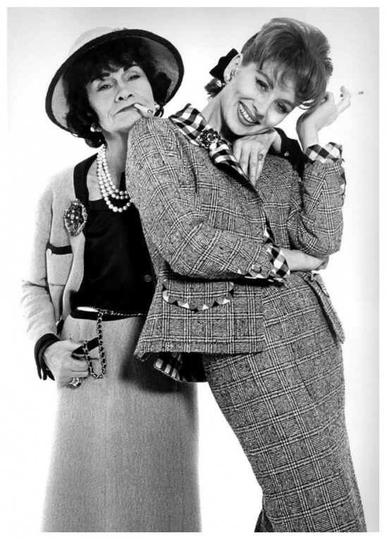
Chanel and Suzy Parker. Photograph: Richard Avedon. 1959

In contrast, Lagerfeld’s Chanel has largely been built around excesses of adornment and a designer-y “busy-ness” that its originator would probably have loathed.  His couture clothes especially often feature cascades of ruffles as well as sumptuous amounts of petals, jewels, and a thousand other bits of “bling.”  Yet, styled for the runway with enough logos, quilted clutches and swinging chain belts, a link to the Chanel ethos remains—however perilously—in place.

Prophetically, esteemed fashion writer Holly Brubach worried about this tendency of Lagerfeld’s early in his tenure with the House of Chanel.  In the early 1980s, in “The Atlantic,” she wrote, “You can’t help but wonder whether the people at Chanel got the wrong man for the job….  In the collections he has designed for Chanel, it’s as if Lagerfeld can’t make up his mind whether to carry on the tradition [of the label] or send it up.”

Perhaps in some ways, Lagerfeld has worked too hard to constantly pay tribute to the iconography–if not necessarily the philosophy–of Chanel.  Is he drowning in his gold chains and “little suits”?  During his spectacular run at Dior (followed by his spectacular, sad exit from the same), John Galliano, showed only a marginal references to his house’s founder; he did not spend his decade at the Dior endlessly revamping the New Look or paying endless homage to other hallmarks of the house.  Other designers talking over established houses have equally kept their founding forbearers’s visions at an arms length; McQueen did little to reinterpret the look of Givenchy during his time at that legendary label.

But, then again, few styles are as easily identifiable as Chanel’s.  Christian Dior was only in business for a decade before his early death in 1954, seven years after the launch of the “New Look.”  In contrast, Chanel, all tolled, designed for over 45 years.  Even those who are only passingly interested in fashion, know the tenets of the Chanel style, and breaking with those touchstones has the veneer of breaking with (or even destroying) a grand and important tradition.  And breaking with tradition is not what one seeks out a Chanel suit or handbag for.

One also has to wonder if Lagerfeld, in fact, even has the desire to cultivate a design style of his own.  When asked about the subject once in 1979, the designer replied, “My style is more:  Another Spring, Another Love.”  And adding later, “I have no opinion whatsoever about my influence, who cares?”

All of this is not to say that Lagerfeld is not an excellent designer.  He is.  He knows fabric; he knows cut.  His clothes are never dowdy or dated,  and Lagerfeld can be innovative.  Certainly his ability to work within the idiom of Chanel’s most popular iconography for the past 30 years bespeaks of a creativity and resourcefulness that many designers could only hope for.  One only wishes though that, over the years, Lagerfeld had harnessed and synthesized those instincts of his into a design philosophy he could fully call his own.  As Lagerfeld is still in good health and shows no indication of retiring or slowing down, the question now is:  could he do it and does he want to?

In the meantime, for both the House of Chanel and Lagerfeld, the weight of the Chanel name and what it stands for has become like a pair of golden handcuffs, beautiful and embossed with interlocking C’s, but unbearably restricting nonetheless.

Posted in Uncategorized | Tagged , , , | 1 Comment

Guest Post- War in Conflict: World War I, Haute Couture and the Fashionable Body (Part I)

By Katy Conover

 Katy Conover is currently working as a research assistant at the Victoria & Albert Museum on the upcoming “Hollywood Costume” exhibition. She received her MA from the RCA/V&A program in History of Design. Her current research focus on early 20th century fashion and the body. This post is from a presentation I she at the Women in Magazines Conference June 23-24 at KingstonUniversity, Kingston, England.
 

When examining fashion during the 20th century, magazines are a vital source for women.  The World War I period is no exception.  Despite the war lasting only 4 years, fashion changes were still occurring and fashion magazines were at the forefront of conveying this information.  Within the pages of Vogue and The Queen, these magazines were conveying information through 3 different means: illustration, photography, and text.  What each one of these ‘said’ about the fashionable body during the war allowed for a montage to emerge to which the illustration, photograph, and text all contributed.  The ‘montage’, in this instance, is best understood through the theorist Theodor Adorno as that which ‘disavows unity through the emerging disparateness of the parts at the same time that, as a principle of form, it reaffirms unity.’[1]  The montage unifies and provides a more accurate understanding of the design changes which were happening during the war years.

In order to understand how magazines contributed to the idea of the ‘montage’, it is necessary to first understand some key points in regards to the overall importance of magazines.  The magazines exploited a recognizable visual landscape with the ‘capacity to re-make itself, each number the same and yet different.’[2]  In regards to fashion magazines, the magazine’s ‘superlative presentation, photography and subject-matter epitomised […] a dream world peopled by the rich, the beautiful, the famous.’[3]  Thus functioning as objects that exposed this ideal, the magazines were a key source through which women could study the fashionable body.  As explained by Beetham: ‘[a]ll ladies’ papers made appearance central to their definition of themselves as well as their readers.  The message was carried primarily by the wealth of high quality illustration.’[4]  Through the magazines, ‘[t]he reader could therefore not only regulate her own consumption to produce the right kind of home and self, she could also recognise and read the signs other women produced.’[5]  However, women were not only ‘reading’ that appearance in the illustrations, but they could also ‘read’ that information through photographs and text.  As mentioned above, illustrations had been considered the main source of information for women reading fashion magazines.  Additionally, photographs and text have been used simply to support the fashionable body presented in the illustrations—omitting contradictory information.  Focusing on the war years, the war did not detract from the aim of these magazines to display, promote, or sell the idea of the fashionable body to the contemporary woman.  There was a continuation of prescribed social codes, which dictated appropriate clothing for every situation.  As stressed by Mary Brooks Picken’s 1918 manual:

[y]ou must realize that if you are going out to business you should not dress as you would if you were going to a church gathering; nor should you, if you are going to an elaborate dinner party, wear a shirtwaist and skirt, as you may be privileged to do at a simple home dinner with your own family or with intimate friends.[6]

Even in 1917 The Queen reported:

 we have our morning, afternoon and evening dresses, costumes for out-of-doors and in, for fine weather and stormy, for sports, work, pleasure—in fact, for every conceivable object and every conceivable occasion, no matter how ordinary or how unusual this may appear to be at first sight.[7]

Despite this advice, there are no images to show how a woman was supposed to know the difference in the looks for these occasions which contradicts Beetham’s assertion that illustrations were paramount for women understanding their fashionable body.  Rather, as the previous image shows, women were expected to know how written description would be translated into the look.  Here the idea of the montage is necessary in order to understand how the fashionable body could be created into a unified ‘look’ from the disparate parts that it is presented.  This assumption of inside knowledge assumes that the contemporary woman could ‘read’ not only the illustration and photographs but also visualize and interpret the text.  From this, the woman could focus on finding her ‘correct’ look in which a woman, must grasp conclusively two points: first, the limitations of her natural outline; secondly, a knowledge of how nearly she can approach the outline demanded by fashion without appearing a caricature, which is another way of saying that each woman should learn to recognise her own type.[8]  Additionally, when taking into account the speed at which seasonality affected fashion, a woman had to become adroit at being able visually to assess the fashionability of an item and, ultimately, of her entire dressed body.  Therefore, the photographs and text included in the pages of Vogue and The Queen went as far to inform a woman about the fashionable aesthetic as seeing the illustration.

scanned from Vogue, February 15, 1914

Vogue, March 15, 1914

As an example, in 1914 Vogue showed that the woman’s silhouette was following a slim line with a continuation of the lavish internal detail of the previous few years.  Women’s fashions maintained a complicated, multi-tiered silhouette: ‘[w]hether we shall be wide from side to side or wide from front to back, or revert again to the unbroken line, are the questions with which the couturiers are preparing to confront us at their spring openings’[9]

The Queen, March 28,1914

Much like the illustrations in Vogue, The Queen was illustrating the same, feminine, multi-layered dresses.  In order to emphasize the ‘new’ fashions The Queen uses its text to try to show a difference between ‘tunic’ and ‘flounce’: ‘[t]he word tunic, it is to be noticed, is being avoided, although these flounces, which are used in groups of twos and threes, are very closely related to the upper skirt, known as a tunic.  The difference, however, rests in a decided fullness, which justifies them being called flounces.’[10] 

Vogue, July 1, 1914

Another factor that contributes to the ‘montage’ are the events of the war, but it is an area that needs further study.  In terms of what the magazines were saying about the war, Vogue credited itself in 1915 with ‘[doing] its part during the war, carrying articles about relief efforts and sponsoring its own appeal for the Sewing Girls of Paris […running] sober stories of sacrifices on the part of the rich for the war effort.’[11]  In the first years of the war, mentions of the war were happening independently from mentions of fashion, especially Vogue.  Additionally, when the war was mentioned in Vogue, its separation from fashion, even within the same article, made the war seem to be more subjective rather than an objective force directly influencing fashion.  

Vogue, March 1, 1915

In the March 1, 1915 article: ‘New Silhouettes Against a Background of War,’[12] in which the ‘new silhouettes’ were not even mentioned until the fourth page of the article after a discussion of general war events—a discussion which was limited to the first page of the article.  Yet interestingly, there are illustrations throughout the article that do not correlate directly with the text.Despite this separation, the war did contribute to the montage which was informing women of the fashionable aesthetic.  This is best related by the author Mrs. Humphry Ward, ‘in the course of months it had become a habit with me never to write about the war; and outside the hours of writing to think and talk of nothing else.’[13]  However, the war was the constant through these years in which its continual presence was a constant source or unity despite the seeming disparity between the illustration, the photograph, and the text.  Yet, as I will explore shortly, the above-mentioned ‘types’ of sources actually also contributed to the unity of the montage. However, this unity between sources was not happening in the middle years of the war.  As such, 1916 was the year of the greatest split between the illustrated fashionable body and the photographed fashionable body in which the disparity between the illustration, photograph, and text was blatant.

In the next post, I will continue to explore fashion’s montage through the height of the magazine’s disparity and how the illustration, image, and text reunify in the later years of the war.


[1] Theodor W. Adorno, Aesthetic Theory, trans. Robert Hullot-Kentor (The Athlone Press, Ltd.: London, 1997), p. 154.
[2] Margaret Beetham, A Magazine of Her Own? (Routledge: London, 1996), p. 10.
[3] Irene Dancyger, A World of Women: An illustrated history of women’s magazines (Dublin: Gill and Macmillan, 1978), p. 119-120.
[4] Beetham, p. 100.
[5] Beetham, p. 96.
[6] Mary Brooks Picken, The Secrets of Distinctive Dress: Harmonious, Becoming, and Beautiful Dress—Its Value and How to Achieve It (International Textbook Press: Scranton, 1918), p. 9-10.
[7] Mrs. Jack May, ‘Fashion’s Forecast: For Indoor Wear’, The Queen, 6 January, 1917, p. 14.
[8] Emily Burbank, Woman as Decoration (Dodd, Mead and Company: New York, 1917), p. 31-2.
[9] Vogue (US), 15 February, 1914, p. 22.
[10] Mrs. Jack May, ‘Fashions’ Forecast’, The Queen, Jan 17, 1914, p. 94.
[11] John Tebbel and Mary Ellen Zuckerman, The Magazine in America 1741-1990 (Oxford University Press: New York, 1991), p. 106.
[12] ‘New Silhouettes Against a Background of War,’ Vogue (US), 1 March, 1915, p. 23.
[13] Mrs. Humphry Ward, England’s Effort: Six Letters to an American Friend (Smith, Elder & Co.: London, 1916), p. 2.
Posted in Research | Tagged , , , , , | 1 Comment