Posing Beauty Exhibition Review

Posing Beauty: African American Images from the 1890s to the Present

At The Newark Museum

By Anna Yanofsky

The cover of Deborah Willis's 2009 book, Posing Beauty: African American Images from 1890 to the Present, on which the exhibition is based.

Beauty is not the first thing that comes to mind when considering the African American experience since the end of the 19th century. Talk to an American about the black experience since the 1800s, and a host of images related to black oppression (think depictions of slaves, segregation, race riots, and crime-ridden ghettos) are more likely to run through their heads than anything with even a touch of prettiness. In contrast to all of those layers of perpetuated images seen again and again in history books and the media, a snapshot of gorgeous, smiling black women posed on an Atlantic City Beach circa 1960 is almost shocking.

In planning a visit to see Posing Beauty: African American Images from the 1890s to the Present via The Newark Museum’s website, a stunning black and white photograph greets you as a part of the featured exhibit’s web presence. The photo of four beautiful women glowing in the sunshine on a beach, dressed in fashionable swimsuits with their hair in loose waves is by John Mosely and is representative of a number of the more charming images comprising the exhibit. Curated by Deborah Willis, the show is a physical display based on the thick, 2009 book of photographs she compiled of the same name. The exhibit was first staged in the galleries of NYU’s Tisch School of the Arts where Willis serves as the chair of the photography department. Since its debut in 2009, the exhibit has traveled, but the Newark Museum may be its most fitting home yet.

John W. Mosley, Atlantic City, Four Women, c. 1960s Gelatin silver print, 9 x 7 1/2 in.

According to the exhibit’s introductory wall text, the photographic and video works on display have been brought together with the goal of leading viewers to examine the perpetuated images of African and African Americans in the media and art. With its record ethnic diversity, poverty struggles, and reputation as a hotbed of racial tensions since the riots of 1967, Newark is an excellent place for ruminations on the representation of black culture and black beauty that span the contexts of race, class, and gender. At over 100 years old, the museum itself has survived Newark’s many incarnations and has posited itself as a “museum of service” acting “in the public trust…to educate, inspire, and transform individuals.” Its mission statement includes a quote from founding Director John Cotton Dana which serves as its guiding principle: “A good museum attracts, entertains, arouses curiosity, leads to questioning—and thus promotes learning.” The photographs lining the walls for Posing Beauty are attractive, entertaining, and curious enough to draw visitors in and lead them to question the images they are seeing. However, that questioning may not be getting to quite the level that the curator intended, and therefore may be falling short of the museum’s goal to promote learning.

Posing Beauty introduces itself as being organized into three distinct sections: Constructing a Pose, Body and Image, and Modeling Beauty and Beauty Contests. The sections themselves are not in chronological order, and the lead through the galleries is gentle but clear. The objects are installed at eye level in varying sizes, but mostly large format. The photographs are either framed neatly or printed onto rigid surfaces. There is nothing distracting or complex about the organization or design of the show. The galleries are painted a clean white, and the framed photos are hung in neat lines or balanced groups that give the effect of esteem and elegance. The arrangement is simple, but full of pride for these works that are mostly virgin to museum walls. The wrap-around lines of framed photographs do their part to lead the viewer through the space. However, this subtle leading, and the aforementioned wall text, serve as the only guidance from the curator that the visitor will receive.

All of the labels in the Posing Beauty show are object labels. There are no didactic labels to be found. The section titles stenciled on the wall are the only guideposts for interpretation once you get past the main wall text, which many visitors passed without reading. In a way this speaks to the perceived power of the photos on view. The old adage says they are supposedly worth 1,000 words, right? So the instinct to let them speak for themselves is understandable—especially in a show that asks the viewer to evaluate the poses they see as texts. However, by not providing any interpretive or illuminating labels, one is left to glean what they can from the photograph, its title, its credited creator, year of creation, and materials. But, is that enough to enlighten the average viewer?

The photographs in the exhibit certainly have a lot to say on their own. Photographs of the known (Denzel Washington, James Brown, Michelle Obama) and the unknown (a diner waitress, a posing group of prom-goers, a pregnant woman kneeling in the grass) show a variety of poses, portrait types, and contexts, and show all types of beauty. Every posture, from defiant to demure is on display; every type of beauty is present. It is all there to be examined, but without some interpretive signposts the examination doesn’t go far enough. Too many questions arose from visitors around the room that had no immediate answers, and should have. Some of the works lost their teachable moments without some explication from a trained eye.

The only non-photographic work on display, Lauren Woods’s The Teenth of June is a strong video piece with smart layers of meaning. The title of the video is a reference to the lesser known but still observed holiday Juneteeth, which marks the 18th and 19th of June, 1865, the days the Emancipation Proclamation was announced in Texas setting the last of the slaves free. The piece is a slow-motion replay of the tense few minutes leading up to the crowning of the first black Miss Texas, the only black woman on the stage. The connections to the little known holiday, the pageant taking place in Texas, and the fact that the woman pictured is the first black Miss Texas are all absent from the presentation. In some ways the piece is still effective, showing the exaggerated masquerade of feminine beauty across race lines. The beauty queens’ stiff, extra-wide smiles unsettled many of the viewers in the gallery. Some college age boys imitated the effusive and dramatic reactions of the ladies as they heard their fate in the pageant, and others laughed as the dubbed-in sci-fi soundtrack made everything even more dramatic. The piece absolutely made an impact about artificial beauty, but without the illuminating details, it lost some of its possible commentary on race. It is not certain whether the expressions of disdainful shock on the fellow contestants’ faces registered with viewers as clearly as they could have had the finer details of the work been brought to the surface.

A still from Lauren Woods's The Teenth of June, 2006.

In some cases, the visitors themselves were more helpful in gaining understanding into the work than the exhibition itself. One woman, who had attended one of the exhibit’s educational lectures, explained a photographic installation piece by Hank Williams Thomas to her boyfriend. She had learned in the lecture that the piece used both black and white photography and color photography to show the difference in the sexualizing of the images as they became color. This detail added a level of depth to the piece that was not on its surface, and would have been great to have pointed out by a trained professional through a didactic label.

Also in need of professional elucidation, was why certain images were shown in their respective sections. Perhaps the organizing subsections of the overall exhibit were too close in definition, but many of the photos could have existed in any one of the sections. It wasn’t always entirely clear why an image of a well-dressed woman was in the Modeling Beauty and Beauty Contests section rather than the Constructing a Pose section. Or, why a modeling shot in Body and Images hung in that grouping rather than the Modeling Beauty section. Many of the photographs could have been shuffled through any of the sections, unless of course there was some detail about them that wedded them to where they were. Some indication from the organizers as to why certain photographs were within their respective sections would have been appreciated.

In spite of the lack of didactic labels, the exhibition was strong. The objects were beautiful and powerful in composition and subject matter. Willis reconstituted the reductive narrative of black history by showing it in all of its beauty. The very first photograph on display served to set the tone of the entire exhibit. A self-portrait of artist Carrie Mae Weems shows her glancing in a hand mirror, dressed in traditional African clothing with her hand raised to her hair. The title of the portrait is, I looked and looked and failed to see what terrified you, 2006. Weems looks to be searching for signs of the identity superimposed on her by the media. Where in this beautiful woman does the stereotype live? Weems can’t find it, and with her extensive collection of culled images, Willis helps you see past it. Taking a second look at the portrait upon exiting through the entrance (the only other exit was through a gallery dedicated to planets) the aptness of its place of honor became clear. Posing Beauty gave viewers so many places to look for stereotypes and find beauty in all of its multifaceted complexity instead.

Photograph by Carrie Mae Weems entitled, "I looked and looked and failed to see what so terrified you," 2006.

Posing Beauty: African American Images from the 1890s to the Present at The Newark Museum, Feb 2- April 28 2011.

Posted in Exhibition | Tagged , , , , | Leave a comment

Color Moves: Art and Fashion by Sonia Delaunay

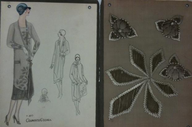
The exhibition Color Moves: Art and Fashion by Sonia Delaunay, at the Copper-Hewitt National Design Museum which opens March 18th, will center “on fashion designs from her own Atelier Simultané in Paris during the 1920s, as well as textiles designed for the Metz & Co. department store in Amsterdam in the 1930s. On view will be examples of designs, textiles, garments and photographs” from French Museums and American and European private collections.


” Known primarily as an abstract painter and colorist, Sonia Delaunay applied her talents and theories to all areas of visual expression, including graphics, interiors, theater and film, fashion and textiles. A trademark of Delaunay’s work is the sense of movement and rhythm created by the simultaneous contrasts of certain colors. “[from the Cooper-Hewitt website] I personally find Delaunay to be a fascinating artist and designer, and I wrote about her here. Special Collections and FIT Archives holds a collection of her sketches which you can see here. Although her work was featured in several exhibitions, especially in Europe, not many design students know and recognize her contribution to the field. Hopefully the exhibition at the Copper-Hewitt will expose her work to a broader audience.

Sonia Delaunay Fashion Illustration. Date of Original: 1919-1923 Source: Plates from portfolio "Sonia Delaunay; ses peintures, ses objets, ses tissus simultanés, ses modes" Special Collections and FIT Archives

You can also read this interesting related post from Sarah Scaturro, a graduate of our program who works at the Cooper-Hewitt.

Posted in Exhibition | Tagged , | Leave a comment

Two new exhibitions at Phoenix Art Museum

Phoenix Art Museum holds a collection of over 4,500 American and European garments, shoes and accessories and hosts four fashion-related exhibitions every year.

The exhibition Fashion Independent: The original Style of Ann Bonfoey Taylor opened February 27th and celebrates the style of this unique women through sixty full ensembles from her couture and costume-designed sporting outfits collection that was donated to the museum in 2008.

Ann Bonfoey Taylor (1910-2007) in Ski outfit, Phoenix Art Museum.

Ann Bonfoey Taylor, who passed away in 2007, was among the first women to earn a pilot’s licence and served the US Air Force during World War II as a flight instructor. She was also a member of the US Women’s Olympic Ski team in 1939, she played Tennis at Wimbledon and was a champion shot and equestrienne.  In addition to her remarkable activities and achievements she was also a lively hostess and a style icon captured by leading photographers such as Edward Steichen, Louise Dahl-Wolfe and Toni Frissel. The exhibition includes examples from designers such as Charles James, Cristobal Balenciaga, Hubert de Givenchy and Madame Gres, and outfits she designed herself for her sporting activities to fit both her fashionable and functional needs.

Madame Grès silk chiffon evening dress ca.1950. Ann Bonfoey Taylor collection, Phoenix Art Museum

Hubert de Givenchy silk gazar and ostrich feather evening coat and dress ca. 1960s. Ann Bonfoey Taylor collection, Phoenix Art Museum

Another fashion-related exhibition will open at the Phoenix Art Museum March 12th will feature three original scenes from the famous Théâtre de la Mode, on loan from the Maryhill Museum of Art in Goldendale, Washington.

A scene from Théâtre de la Mode, Maryhill Museum of Art.

This traveling miniature mannequins exhibition, launched in Paris in 1945, showcased the work of Parisian couturiers, milliners, jewelers, hairdressers and theater designers in hope to restore Paris’s fashion industry after World War II. The exhibition traveled in European cities, arrived in the United States in 1946 and was finally acquired by the Maryhill Museum of Art in 1952, where it is now permanently housed.

Fashion Independent
Steele Gallery
February 27, 2011 – May 29, 2011

Théâtre de la Mode
Ellman Fashion Design Gallery
March 12, 2011 – July 31, 2011

Phoenix Art Museum, 1625 N. Central Avenue, Phoenix, Arizona

Posted in Exhibition | Tagged , , , , , , , , , , | Leave a comment

Vivienne Westwood, 1980-89, opens March 8th

This is a reminder that tomorrow is the opening of the exhibition Vivienne Westwood, 1980-89 which was organized and curated by the graduate students of our program. To read more about it, click here.

Vivienne Westwood, “Rocking Horse” boots, leather and wood, 1987, England, Gift of Francisco Melendez A.K.A. Francois. The Museum at FIT.

Posted in Exhibition | Tagged , | Leave a comment

The Changing Face of William Shakespeare Exhibition Review

The Changing Face of William Shakespeare

At The Morgan Library & Museum

By Donna Ho

Artist unknown, The Cobbe Portrait of William Shakespeare, Ca. 1610, Oil on panel. Collection of Archbishop Charles Cobbe (1686–1765), Cobbe Collection

Attributed to John Critz the Elder,Flemish, Antwerp 1551/52 – 1642 London. Henry Wriothesley, 3rd Earl of Southampton, as a Youth, Oil on panel. Collection of Archbishop Charles Cobbe (1686–1765), Cobbe Collection

The premise of this exhibition at the Morgan Library and Museum is to present a painting discovered in 2009 and posited to be the only known portrait of Shakespeare painted in his lifetime, as well as the “prime version” used for many derivative paintings. Called the Cobbe portrait after the family who owns it, the portrait is shown with another recently identified portrait, that of Henry Wriothesley, 3rd Earl of Southampton, who was Shakespeare’s literary patron.

The introductory text, appropriate in length at about 200 words, makes clear the exhibition’s subject and significance with key phrases such as “for the first time in the United States,” “the first primary version of several derivative portraits,” three of which “are also being presented for the first time.” In addition to repeating the word “first” to emphasize the exhibition as a premiere of sorts, the text informs visitors that “the only two portraits previously accepted as authentic representations are posthumous” and “lack credibility as true likenesses.” The last sentence of the introductory text explicitly defines the exhibition’s three goals:

“This exhibition seeks to contextualize Shakespeare’s connection to his patron, to trace the intriguing similarities and differences between the Cobbe portrait and its derivatives, and to explore our changing perceptions of Shakespeare’s image over the course of the past four centuries.”

The one-room exhibition contains thirteen objects (nine three-dimensional, four wall-printed). All of the objects are well-chosen to fulfill the exhibition’s three stated goals: to contextualize, to trace, and to explore. The three derivative paintings and engravings “trace” back to the Cobbe portrait; the queen’s gift roll and portrait of Wriothesley “contextualize” the earl’s status, while the dedication page reveals and complicates the relationship between patron and artist (its first words are “The love I dedicate to your lordship is without end”). The wall-printed arguments for and against the Cobbe portrait being the “primary version” explore the contentious topic of Shakespeare’s  “face” over time. These elements support the Morgan Library and Museum’s mission, in particular in their “present[ation] and interpret[ation]” of a “collection of extraordinary quality.” The complete mission is “to preserve, build, study, present, and interpret a collection of extraordinary quality, in order to stimulate enjoyment, excite the imagination, advance learning, and nurture creativity.”

The exhibition is contained in one square room, about 25 feet long per side, with high ceilings. Upon entering through glass double doors, the introductory text is immediately to the left (on the north wall, flush to the doors). After reading the text, visitors will likely follow the walls of the room clockwise, proceeding to the dedication and Wriothesley portrait on the west wall. On the south wall, directly opposite the double doors and therefore the focal point upon entry, is the Cobbe portrait, flanked by the printed arguments for and against its “primary version” status. On the west wall are three derivative portraits of Shakespeare, and on the remaining north wall area are three engravings. The center of the room contains two glass vitrines of equal height. One holds two books, while the other contains the queen’s gift roll.

As a one-room exhibition whose objects are few and focused, visitors can take any path and still experience the show cohesively. If a visitor’s time is limited, the Cobbe portrait is immediately recognizable in its showcased position on the south wall.

In addition to being well-placed, the style and vocabulary of the signage and labels are appropriate for the exhibition’s target audience. All of the nine (three-dimensional) objects have both object and didactic labels—an advantage of the exhibition’s small size—enhancing the effectiveness of the show’s educational goals. This also shows the museum’s awareness of its audience: Shakespeare lovers, therefore readers. The didactic labels range from 120 to 140 words in length, and are sufficiently varied in content. Some contain important facts about provenance and dating (“Tree-ring dating indicates that it was painted on a panel of Baltic oak some time after 1608”); others might confirm a visitor’s likely response to the object—for example, that the Wriothesley portrait was “for centuries believed to represent a woman”—or compare details between portraits (on the 19th century portrait of Shakespeare): “[i]n form and ornamentation the doublet he wears is more or less identical to those in other pictures derived from the Cobbe portrait, but the lace collar is less elaborate and less convincing…” Appropriately, the Cobbe portrait’s label is slightly longer than some of the other object labels, and offers evidence for its execution during Shakespeare’s lifetime:

“This panel of English oak, felled between 1579 and 1595, was seasoned for several years before being painted around 1610, when the form of collar depicted became fashionable…alterations to the location of the eyes and ear made during painting suggest it was done from life.”

Aside from the introductory text and dedication page facsimile (enlarged to clearly show the folio typeface and conventions) the arguments “for and against” the Cobbe portrait comprise the other large areas of wall-printed text in the exhibition. This clever and effective presentation appears on the focal south wall. The exhibition title appears in large font above the portrait. The supporting case, to the left of the portrait, is introduced with the instantly recognizable phrase “To be,…” followed below by seven short paragraphs offering evidence, whose headers (in all capital letters) are: The Prime Version, The Proliferation of Copies, The Droeshout Engraving, The Hair (Or Lack of It, The Cast to the Eye, and The Inscription. On the portrait’s right side, the famous phrase is continued “…or not to be” as a header, followed by four paragraphs with reasons cited by Cobbe portrait detractors (again these appear in all capital letters): The Sitter Looks Too Young, The Sitter is Too Richly Dressed, The Folger Shakespeare Library Copy Was “Faked” into a Portrait of Shakespeare by Overpainting the Hair with Baldness around 1777, and In 1964 the Sitter in the Shakespeare Birthplace Copy was Identified by David Piper as the Minor Courtier Sir Thomas Overby. The font size used for the paragraphs on this wall was small in comparison to the didactic labels and could have been made larger without diminishing their visual “pedestal” to the Cobbe portrait.

The overall design of the exhibition is visitor-friendly and attractive. The exhibition room, directly off the Morgan’s central lobby, catches a visitor’s eye with two large squares (a portrait and the show’s title) above its glass double doors. Inside the room, a neutral palette is utilized which shifts from dark to light upward: gray-brown bases and object supports for the vitrines; beige walls (up to a line at the height of the doors, with off-white paint above), and signage in black (labels and didactic text) or maroon (titles and headers) lettering. The font used for the title and the famous phrase from Hamlet evoke the folio typeface of the dedication page facsimile, furthering the exhibition’s aims to contextualize and interpret past and continuing scholarship on Shakespeare’s representation. Inside the two vitrines, labels and didactic text are mounted at a slight angle to facilitate reading. Appropriately, the technology used is minimal and subtle (the enlarged facsimile page is the only “enhanced” object in the exhibition) and the groupings of engravings and paintings communicate to visitors the “chapters” in the narrative and premise of the exhibition.

Visitors seemed very engaged with all objects on view and many viewed certain objects more than once. Attracting the most attention were, understandably, the Cobbe portrait and that of young Wriothesley (whose portrait is likely provocative to contemporary viewers with its ambiguous gender cues). The gift roll bearing Queen Elizabeth’s signature was also well-circled, while the engravings’ monochrome and smaller size seemed to hold viewers’ attention less well. Some visitors spent only a few minutes in the room, being perhaps in a rush or misjudging the value of the show by its modest physical footprint. But most visitors lingered for at least fifteen minutes in the room, reading each didactic label, studying the portraits and objects, and discussing with others what they saw.

I enjoyed the specific focus of the exhibition, the physically enclosed space, and the sense that each object was absolutely essential to the “why?” of the exhibition. It successfully met its stated aims, and left me with a strong awareness that scholars are far from general agreement about facial representations of Shakespeare. Staying in the room for over two hours at a stretch was made more comfortable given the absence of any security guard. I recommend this exhibition to anyone with specific interest in Shakespeare or literary scholarship.

The Changing Face of William Shakespeare, The Morgan Library & Museum, 225 Madison Avenue, New York, NY 10016. February 4 through May 1, 2011

Posted in Exhibition | Tagged , , | Leave a comment

On Pins and Needles on Facebook

We are on Facebook, become our friends!

Posted in Uncategorized | Leave a comment

When Nicolas Met Cristobal

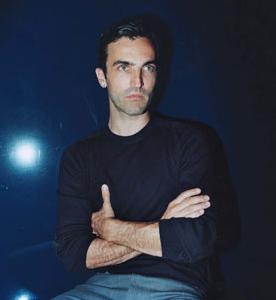
Nicolas Ghesquière. Photograph by Thibault Montamat

Cristobal Balenciaga

Let’s start with a confession: I am a total fashion magazines addict, I read them cover to cover, I cut out images that I like and I find it hard to throw them away so they just pile up in my apartment and when I move- they move too. W magazine has always been one of favorites. Maybe it’s the large images which I often use for my collages, or the fact that there is always something interesting to read regarding fashion, art and culture. Well, until recently. Since Stefano Tonchi took over as Editor in Chief last year I relate to this magazine less and less. As much as I admire the man, his experience and knowledge, and whilst the editorials are still beautiful it seems there is less substance and more, well… how to put it? It is so much more commercial and shallow. I can hardly find anything to read anymore and sometimes I can’t even tell the difference between the ads and the actual articles. Or maybe I am just getting old….

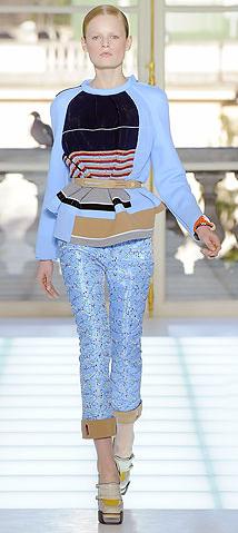
However, the March issue that just landed in my mail box was somewhat of a pleasant surprise. It features a very interesting interview with Balenciaga’s Nicolas Ghesquière. And here too a confession is in place: it was not until his Fall 2010 that I started to like the designer, I didn’t GET him. But with time his style is growing on me, and I can see past the hype (which always turns me off) surrounding him. His Fall 2010 collection, I thought, was a work of a genius- the cut, the color combination, the over all style- feminine yet not girly, seductive yet not revealing. And the Cristobal atmosphere is there- especially in the simple lines and those sloped shoulders.

Balenciaga by Nicolas Ghesquière. RTW Fall 2010Photo: Marcio Madeira, FirstView.com

In the interview Ghesquière explains how deeply he is influenced by the legacy of Cristobal Balenciaga. Primarily it is the Edition collection for which original Balenciaga designs are reproduced. “It’s our tribute to Cristobal”, he explains to interviewer Alice Rawsthorn, “ We find something we like, one of his timeless couture pieces, and it’s almost a surgical process, because we open up the piece and look at everything, trying to analyze how he did it. The development takes time; usually the fabric is the most difficult because the yarns don’t exist anymore, and the quality of the weaving isn’t the same. Sometimes it can take a year to get it right, and although it’s, well, not exactly a peaceful process, it’s a relief compared to the rush of trying to find new idea.” In my mind I keep coming back to a story told by Hamish Bowles, curator of the exhibition Balenciaga: Spanish Master, when he appeared in FIT last December to discus the work and research for the exhibition. He mentioned that during conservation work on one of the pieces they found detailed and meticulous handwritten instructions left by Balenciaga himself for his tailor on the inside of the garment. The designer, Bowles said, was known to run his studio in complete silence, almost like a lab, and each collection included one garment that was designed and sewn entirely by him. And the reason that this comes to mind is because friends and employees describe Ghesquière as not less meticulous and dedicated as the master himself.

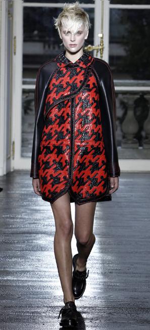
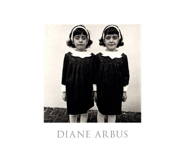
The stunning Spring/summer 2011 collection opened with a checked coatdress, the creation of which he describes in the interview “The first idea was, let’s try to do an organza dress in the leaf shape that Cristobal often did, I’m like ‘Mmm, mmm, non! It’s not a dress, it’s a coatdress.’ The second step was to build a coatdress. The third step was: ‘Organza is awful. It’s so couture. Let’s find another fabric, some synthetic rubber or plastic thing.’ The next step was to try a print, but that wasn’t working, so we used flat technique of Swiss mechanical embroidery instead. Then we developed the check. Then we start to build the shape. Then we use magnets to flatten the closure. After all that work, which isn’t cheap, I felt the whole plastic thing looked a bit Seventies tacky, so I thought we need beautiful plain black leather for the sleeves and collar. Then we did a whole session to choose contrasting color for the stitching. Then we worked on the collar, which was inspired by one in Diane Arbus photograph. It all took about three months, and maybe 20 or 25 fittings.” The result is striking, and looks like nothing else in the fashion world right now. The initial inspiration was Balenciaga’s design, but the result is totally original. In my point of view Ghesquière perfectly balances legacy and newness, I am sure Cristobal would have been pleased…

Balenciaga by Nicolas Ghesquière, RTW Spring/Summer 2011. Photo: Monica Feudi / GoRunway.com

Identical Twins, Roselle, NJ 1967

Ghesquière sums up his feelings for the master “It’s impossible to be bored with Cristobal. No other designer compares to him. Every time I go to the archive I see something different. When I was in New York in December, I went with James to see Hamish Bowles’s little exhibition on Cristobal at the Queen Sofia Spanish Institute. It was quite fantastic. The radicalism. The modernity. The touch and mass of the fabric. And I felt so proud.”

I find the last remark quite interesting as I think this is where the difference between the two lays, the way each treats the fabric. Balneciaga had a unique ability to create a piece that looks constructed and soft at the same time, while Ghesquière’s designs, even when they are made of soft fabric, seem so have a rigid quality to them.

The interview is a glimpse into the creative process of Ghesquière and his team, and underlines the challenges he faces with keeping the tradition of the house while marching it forward. This is the type of material I expect from my fashion magazines! I guess I will renew my W subscription after all, maybe the new format will grow on me the way Ghesquière style did.

Posted in interviews | Tagged , , , | Leave a comment

Who Are You Madame Marge’?

I have recently started my internship at the Special Collections and FIT Archives . One of my projects involves a collection created by Madame Marge’, donated to FIT by her sister, daughter and grand-daughter in 1957. Chances are, like me, you never heard of Madame Marge’. Well, for me, discovering designers lost to history is a true pleasure, and one that provides the chance to flex my research muscles. My assignment is to create a finding aid for this collection, which is essentially a research tool that helps scholars and researchers to get a better idea of what the collection contains before they come in to view it.
The collection includes several boxes, three of them contain incredible water-colored women’s fashion illustrations, each accompanied by a swatch of fabric or trim. In addition each illustration is labeled with an original Studio Marge’ Chicago stationary including its name, price, fabric information and even available colors. Another box contains black ink sketches with hand written notes, concerning fabric, length of material needed for the model and other technical information. From a fashion researcher stand point this is a true treasure, and an opportunity. As beautiful as the sketches are, it is the context that gives them meaning. Who made them? when and why? What were they used for?

Marge' Studio Chicago. Velvet coat -dress with velvet applique', watercolor and ink, undated, artist unknown. Marge' Studios Collection. Courtesy Special Collections, Gladys Marcus Library, Fashion Institute of Technology- SUNY


Marge' Studio Chicago. Red velvet evening dress with embellished neckline, watercolor and ink, undated, artist unknown. Marge' Studios Collection. Courtesy Special Collections, Gladys Marcus Library, Fashion Institute of Technology- SUNY


Madame Marge', dress, detailed hand written notes, black ink, undated, artist uknown. Marge' Studios Collection. Courtesy Special Collections, Gladys Marcus Library, Fashion Institute of Technology- SUNY

The fifth box was helpful in dusting off some of the mystery surrounding this unknown designer. It contains one thick scrap book which was put together by the donors, with pictures of Madame Marge’ and her family, some biographical information, images  from her Batik collection (more about that soon) and paper clippings regarding the collection and her work from various American publications. This was very helpful, it provided some key information about the designer, information which was not readily available in any other source online or elsewhere.
So who was this mysterious Madame Marge’?
Despite the pseudo French name she was actually born 1878 in Philadelphia as Marguerite Norlin. She run a successful fashion firm between the two World Wars and had studios both in Chicago and Madison Ave., New York. She designed under her own name but also sold her original designs to other American fashion houses and retailers. She won several awards for originality in fashion design, and in 1915 the sketches that won her her first Gossard Trophy were featured on the front page of Women Wear Daily, she went on to win two more Gossard Trophies by 1918.


Madame Marge' 1878-1950. Marge' Studios Collection. Courtesy Special Collections, Gladys Marcus Library, Fashion Institute of Technology- SUNY

Madame Marge’ apparently had great skills in draping, as she was invited to drape a model in front of an audience in an event held in her home town Philadelphia for the British designer Lucile (Lady Duff Gordon) and included the designer’s fashion show. It is said, by the donors, that later on in her career she had made other such presentations in front of audience and students in universities across the country and had a great desire to educate others and share her knowledge and skills.
In 1926 she broke tradition when she showed the wedding gown designed for her soon-to-be-married daughter in a fashion show held by the Fashion Art League in Chicago. At that time it was extremely nontraditional practice to show a bride’s gown in public before the day of the wedding. The collection at FIT includes five ink and watercolor illustrations of wedding gowns which might have been sold at the retail store Marshall Field & Co. from these two bits of information we can draw that Madame Marge’ was quite known for her bridal gowns.

Madame Marge', wedding gown sketch, ink and watercolor. Possibly created for, or sold at, Marshal Field & Co. Undated, artist unknown. Marge' Studios Collection. Courtesy Special Collections, Gladys Marcus Library, Fashion Institute of Technology- SUNY

It seems that Madame Marge’ was all for new experiences and exploration, in 1936 she created one of her most successful collections the Batik Collection. Earlier, in 1935, she was approached by a fabric merchant who suggested to her fabrics purchased in Bali, based on the fact that she successfully experimented with other exotic fabrics, such as Indian scarves,  in the past. She liked the printed cottons her offered, but asked that the patterns and colors be adjusted to the taste of her American clients. Her instructions were delivered to the craftsmen in Bali, meanwhile she started to drape and prepare the patterns for the collection. Early in 1936 she received the fabrics, printed in Balinese traditional style yet in keeping with her guidelines. the collection she created was a hit, it included day dresses, beachwear, evening gowns and even accessories. the usually low-profile exclusive business she run, suddenly got her quite a lot of press, which is documented in paper clippings now found in the collection at FIT.

Mamde Marge', Sarong Dress, the most successful ensemble from the Batik collection, 1936-1937. 1953-95-1a--e Philadelphia Museum of Art.

Madame Marge', cotton cap from the Batik collection. 1936-1937. Philadelphia Museum of Art.

The picture below is the earliest example I found of her work, this 1910 dress was offered for sale on the website bustledress.com and further demonstrates the range of her skills as a designer.

Marguerite New York, evening dress, 1910. The label on the dress indicates that it was made prior to establishing Marge' Studios when she was still designing under her given name, Marguerite.

It seems, from the varying styles and the range of her creativity, the Madame Marge’  responded to trends and fashions of her time yet was innovative and original. How come so little in known about her? Was it not for the donation her family made to both FIT and the Philadelphia Museum of Art she might have been completely forgotten. Scholar Madelyn Shaw explains in her research dedicated to the Tirocchi sisters that at the time “there were probably dozens of women like her, successful to varying degrees, who survived primarily through word of mouth, as the Tirocchi sisters did, and who in fact preferred to keep a low profile and an exclusive clientele.”

Well, I guess it’s up to us fashion scholars and researchers to make sure Madame Marge’ and her like will be remembered and appreciated for their contribution to the American fashion world.

References

***Many thanks to Filomena D’Elia who wrote an unpublished research about Madame Marge’, and for Madelyn Shaw for their kind help.

Madelyn Shaw, American Fashion: The Tirocchi Sisters in Context http://tirocchi.stg.brown.edu/essays/print/shaw.html

Philadelphia Museum of Art http://www.philamuseum.org/collections/permanent/144036.html?mulR=21126

1910 Marguerite (Madame Marge’)  evening gown
http://www.bustledress.com/cgi-bin/z.pl//item.lisa0001-20091013-01.html

Posted in Uncategorized | Tagged , , | 5 Comments

Balenciaga: Spanish Master

Balenciaga Evening Ensemble, 1967, Balenciaga Archives, Paris

Hopefully you have had a chance to visit the Balenciaga: Spanish Master exhibition, on view at the Queen Sofia Spanish Institute. The exhibition is the first to present Balenciaga’s masterpieces within the context of the cultural and artistic influences of his native country.

I had the privilege to contribute research to this gorgeous show, which was curated by Hamish Bowles. As many of you already know, research for fashion exhibitions involves, among other things, flipping through endless magazines, cover to cover. Molly Sorkin and Jennifer Park, the research associates for Balenciaga: Spanish Master, enlisted interns to assist with this seemingly endless task.

Along with several other researchers, I was charged with paging through Harper’s Bazaar: every issue from 1937 (the year Maison Balenciaga opened in Paris) to 1972 (when the famed couturier passed away). We were asked to scan and submit any editorials that featured a Balenciaga garment, mentioned the renowned designer, or referenced Spain or Spanish culture. Press coverage in this magazine was particularly comprehensive as one of Balenciaga’s earliest and most devoted champions, Carmel Snow, was editor-in-chief of Harper’s Bazaar from 1933-57.

I only contributed a small amount of work to this exhibition, but it was an incredible learning experience. In a way, the process was strangely abstract: one minute you’re alone in the periodicals of the library, and the next the show is a reality. In this case the reality is breathtaking, so, if you haven’t seen it, you have a few more days! Hurry, Balenciaga: Spanish Master closes on February 19th.

Exhibition Information:
Gallery Hours: Mon. – Tues.: 10 a.m. – 6 p.m. ; Wed.-Fri.: 10 a.m. – 8 p.m. ; Sat.: 10 a.m. – 8 p.m.
Admission: $15 for adults; $10 for students, seniors, and Institute members.
Queen Sofia Spanish Institute
684 Park Avenue (between East 68th and 69th)
New York, NY 10065

Posted in Exhibition | Leave a comment

Exhibition- Vivienne Westwood, 1980-89

The exhibition Vivienne Westwood, 1980-89 which opens March 8th, has been organized and curated by the graduate students of our program.

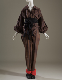
World’s End (Malcolm McLaren and Vivienne Westwood), unisex ensemble, multicolor striped cotton, Pirates collection, Fall 1981, England, gift of Barbara Hodes.

Vivienne Westwood, 1980-89 is the first exhibition to examine Vivienne Westwood’s transformation from “street” provocateur to high-end fashion designer during the 1980s. Westwood began the decade outside the mainstream, as a designer of subcultural style, but as her work evolved so did her level of press coverage and the breadth of her clientele. By 1989, she was a celebrated vanguard in the fashion world. The magnitude of her remarkable rise was confirmed when she was named British Designer of the Year in both 1990 and 1991.

The exhibition features garments drawn exclusively from the Museum at FIT’s permanent collection, as well as complementary photographs, magazines, and videos. Several looks from Westwood’s early years are being shown, including an ensemble from the influential Pirate collection of 1981. The slouchy, 18th-century inspired Pirate clothes could be worn by both men and women, and were a perfect fit for the post-punk aesthetic of the New Romantics. Westwood’s witty clothes in the early 1980s were produced in collaboration with her partner at the time, artist and music manager Malcolm McLaren. Their work was closely tied to the music scene, and the designs were worn by club kids and bands on MTV.


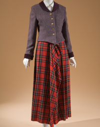
Vivienne Westwood, woman’s jacket and skirt ensemble, purple tweed, red tartan wool, white cotton, Time Machine collection, Fall 1988, England, museum purchase.

In 1984, Westwood and McLaren ended their partnership, and Westwood unveiled her first solo collection in 1985. Her designs for the latter half of the decade revealed a clear aesthetic shift to a more structured and feminine approach. As seen in the exhibition, a tartan and tweed ensemble from the Time Machine collection (Fall/Winter 1988-89) modernizes the aesthetic of traditional British dress—the fabrics are conventional, but the cuts are innovative and contemporary.  Westwood again puts a spin on historical style with her corset and pannier skirt (also from Time Machine) which showcase her ability to update historical shapes for a fashion-conscious audience. According to Museum at FIT director Dr. Valerie Steele, the revival of the corset was “perhaps the most important of Westwood’s innovations.”


Vivienne Westwood, “Statue of Liberty” corset and skirt, silver leather, silver metallic lamé and white silk tulle, Time Machine collection, fall 1988, England, museum purchase

The exhibition concludes with a never-before-exhibited menswear ensemble from the Civilizade collection (Spring/Summer 1989).  A bi-colored knit ensemble, with articulated elbow- and kneepads, combined Westwood’s interest in medieval heraldry with padding that is usually associated with skateboarding.  The outfit underscores Westwood’s ability to unite historical costume, street culture, and mainstream fashion—elements that continue to be relevant to her work today.

Vivienne Westwood, man’s two-piece ensemble, red and gold cotton jersey, Civilizade collection, spring 1989, England, museum purchase.

Vivienne Westwood, 1980-89
Gallery FIT
March 8 through April 2, 2011


Posted in Exhibition | Tagged , , | 1 Comment